Gretchen Rubin

Intro
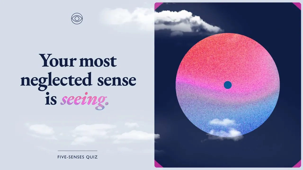
Giving one of the world's most recognized voices a visual identity worthy of what she's built. THE CHALLENGE Gretchen Rubin is a New York Times bestselling author and one of today's most influential voices on happiness and human nature. Her website was her most important brand touchpoint — and it wasn't doing her justice. The challenge was to redesign, rebuild, and reintroduce gretchenrubin.com in a way that felt as considered, warm, and intellectually rich as her work. THE APPROACH We started with the logo. Rather than a generic wordmark, we gave it an intentionally writerly feel — a classic typeface found frequently in print, chosen because it felt like the books she writes. Then we hid a bluebird in the wordmark: a symbol of happiness with deep personal meaning for Gretchen, and a quiet piece of surprise and delight for anyone who finds it. From there we rebuilt the full site — new structure, new content architecture, new navigation — and developed a refined brand strategy to establish a more engaging, more cohesive presence for her personal brand. The collaboration extended into her book launch for Life in Five Senses. We designed a companion quiz and created five unique animations — one for each sense — making the experience as dynamic and layered as the book itself. THE RESULT Increased user traffic to gretchenrubin.com following launch. "The new design is far easier to search, more visually appealing, more streamlined, and more accessible." — Gretchen Rubin
Where I come in:
Creative Direction
Branding
Logo Design
Website Design
On-Set Direction
Concept & Campaign Strategy
Art Direction
Year
/
2024
Client
/
Gretchen Rubin


